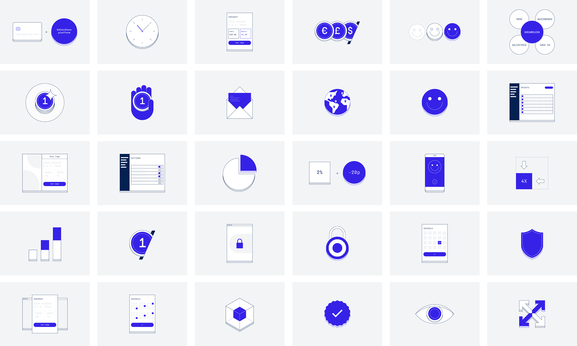
In 2019/2020 GoCardless went through a complete rebrand and as part of that project I was tasked to update our spot illustrations. These visuals are used on the website and landing pages, on the product dashboard, and sometimes in marketing communications.
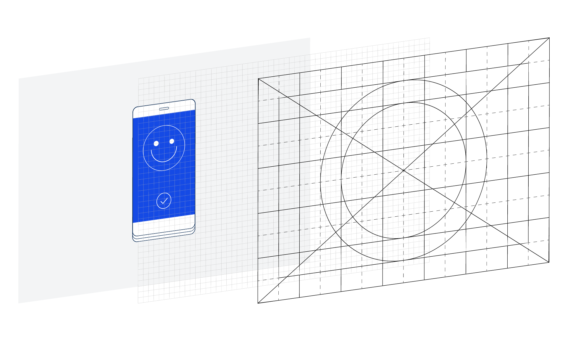
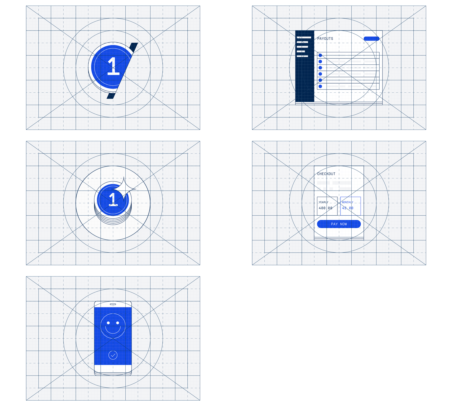
The team had an initial idea about the look based on a set of illustrations used in a previous campaign. After analyzing the existing visuals I created a grid system and defined a set of colors and styles to weed out inconsistencies and to make it easier to create a high number of new illustrations. This system is meant to help maintain a unified style on a large set of visuals designed by several people.


